 |
| Banner |
Button 1

<button id="btnps" role="button">I am Button</button>

<style>
/* CSS */
#btnps {
  --c: #fff;
  /* text color */
  background: linear-gradient(90deg, #0000 33%, #fff5, #0000 67%) var(--_p,100%)/300% no-repeat,
    #004dff;
  /* background color */
  color: #0000;
  border: none;
  transform: perspective(500px) rotateY(calc(20deg*var(--_i,-1)));
  text-shadow: calc(var(--_i,-1)* 0.08em) -.01em 0   var(--c),
    calc(var(--_i,-1)*-0.08em)  .01em 2px #0004;
  outline-offset: .1em;
  transition: 0.3s;
}

#btnps:hover,
#btnps:focus-visible {
  --_p: 0%;
  --_i: 1;
}

#btnps:active {
  text-shadow: none;
  color: var(--c);
  box-shadow: inset 0 0 9e9q #0005;
  transition: 0s;
}

#btnps {
  font-weight: bold;
  font-size: 2rem;
  margin: 0;
  cursor: pointer;
  padding: .1em .3em;
}
</style>
Button 2

<button id="btnwow" role="button">I am Button 2</button>

<style>
/* CSS */
#btnwow {
  --b: 3px;   /* border thickness */
  --s: .45em; /* size of the corner */
  --color: #373B44;

  padding: calc(.5em + var(--s)) calc(.9em + var(--s));
  color: var(--color);
  --_p: var(--s);
  background:
    conic-gradient(from 90deg at var(--b) var(--b),#0000 90deg,var(--color) 0)
    var(--_p) var(--_p)/calc(100% - var(--b) - 2*var(--_p)) calc(100% - var(--b) - 2*var(--_p));
  transition: .3s linear, color 0s, background-color 0s;
  outline: var(--b) solid #0000;
  outline-offset: .6em;
  font-size: 16px;

  border: 0;

  user-select: none;
  -webkit-user-select: none;
  touch-action: manipulation;
}

#btnwow:hover,
#btnwow:focus-visible{
  --_p: 0px;
  outline-color: var(--color);
  outline-offset: .05em;
}

#btnwow:active {
  background: var(--color);
  color: #fff;
}
</style>
Button 3
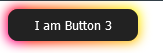
<button id="btnssp" role="button">I am Button 3</button>

<style>
/* CSS */
#btnssp {
  padding: 0.6em 2em;
  border: none;
  outline: none;
  color: rgb(255, 255, 255);
  background: #111;
  cursor: pointer;
  position: relative;
  z-index: 0;
  border-radius: 10px;
  user-select: none;
  -webkit-user-select: none;
  touch-action: manipulation;
}

#btnssp:before {
  content: "";
  background: linear-gradient(
    45deg,
    #ff0000,
    #ff7300,
    #fffb00,
    #48ff00,
    #00ffd5,
    #002bff,
    #7a00ff,
    #ff00c8,
    #ff0000
  );
  position: absolute;
  top: -2px;
  left: -2px;
  background-size: 400%;
  z-index: -1;
  filter: blur(5px);
  -webkit-filter: blur(5px);
  width: calc(100% + 4px);
  height: calc(100% + 4px);
  animation: glowing-btnssp 20s linear infinite;
  transition: opacity 0.3s ease-in-out;
  border-radius: 10px;
}

@keyframes glowing-btnssp {
  0% {
    background-position: 0 0;
  }
  50% {
    background-position: 400% 0;
  }
  100% {
    background-position: 0 0;
  }
}

#btnssp:after {
  z-index: -1;
  content: "";
  position: absolute;
  width: 100%;
  height: 100%;
  background: #222;
  left: 0;
  top: 0;
  border-radius: 10px;
}
</style>
Button 4
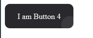
<button id="btncool" role="button">I am Button 4</button>

<style>
/* CSS */
#btncool {
  all: unset;
  width: 100px;
  height: 30px;
  font-size: 16px;
  background: transparent;
  border: none;
  position: relative;
  color: #f0f0f0;
  cursor: pointer;
  z-index: 1;
  padding: 10px 20px;
  display: flex;
  align-items: center;
  justify-content: center;
  white-space: nowrap;
  user-select: none;
  -webkit-user-select: none;
  touch-action: manipulation;
}

#btncool::after,
#btncool::before {
  content: '';
  position: absolute;
  bottom: 0;
  right: 0;
  z-index: -99999;
  transition: all .4s;
}

#btncool::before {
  transform: translate(0%, 0%);
  width: 100%;
  height: 100%;
  background: #28282d;
  border-radius: 10px;
}

#btncool::after {
  transform: translate(10px, 10px);
  width: 35px;
  height: 35px;
  background: #ffffff15;
  backdrop-filter: blur(5px);
  -webkit-backdrop-filter: blur(5px);
  border-radius: 50px;
}

#btncool:hover::before {
  transform: translate(5%, 20%);
  width: 110%;
  height: 110%;
}

#btncool:hover::after {
  border-radius: 10px;
  transform: translate(0, 0);
  width: 100%;
  height: 100%;
}

#btncool:active::after {
  transition: 0s;
  transform: translate(0, 5%);
}
</style>
Button 5

<button class="btnglitch" role="button">I am Button 5</button>

<style>
/* CSS */
.btnglitch,
.btnglitch:after {
  width: 150px;
  height: 76px;
  line-height: 78px;
  font-size: 20px;
  font-family: 'Bebas Neue', sans-serif;
  background: linear-gradient(45deg, transparent 5%, #FF013C 5%);
  border: 0;
  color: #fff;
  letter-spacing: 3px;
  box-shadow: 6px 0px 0px #00E6F6;
  outline: transparent;
  position: relative;
  user-select: none;
  -webkit-user-select: none;
  touch-action: manipulation;
}

.btnglitch:after {
  --slice-0: inset(50% 50% 50% 50%);
  --slice-1: inset(80% -6px 0 0);
  --slice-2: inset(50% -6px 30% 0);
  --slice-3: inset(10% -6px 85% 0);
  --slice-4: inset(40% -6px 43% 0);
  --slice-5: inset(80% -6px 5% 0);

  content: 'POMSD';
  display: block;
  position: absolute;
  top: 0;
  left: 0;
  right: 0;
  bottom: 0;
  background: linear-gradient(45deg, transparent 3%, #00E6F6 3%, #00E6F6 5%, #FF013C 5%);
  text-shadow: -3px -3px 0px #F8F005, 3px 3px 0px #00E6F6;
  clip-path: var(--slice-0);
}

.btnglitch:hover:after {
  animation: 1s glitch;
  animation-timing-function: steps(2, end);
}

@keyframes glitch {
  0% {
    clip-path: var(--slice-1);
    transform: translate(-20px, -10px);
  }
  10% {
    clip-path: var(--slice-3);
    transform: translate(10px, 10px);
  }
  20% {
    clip-path: var(--slice-1);
    transform: translate(-10px, 10px);
  }
  30% {
    clip-path: var(--slice-3);
    transform: translate(0px, 5px);
  }
  40% {
    clip-path: var(--slice-2);
    transform: translate(-5px, 0px);
  }
  50% {
    clip-path: var(--slice-3);
    transform: translate(5px, 0px);
  }
  60% {
    clip-path: var(--slice-4);
    transform: translate(5px, 10px);
  }
  70% {
    clip-path: var(--slice-2);
    transform: translate(-10px, 10px);
  }
  80% {
    clip-path: var(--slice-5);
    transform: translate(20px, -10px);
  }
  90% {
    clip-path: var(--slice-1);
    transform: translate(-10px, 0px);
  }
  100% {
    clip-path: var(--slice-1);
    transform: translate(0);
  }
}

@media (min-width: 768px) {
  .btnglitch,
  .btnglitch:after {
    width: 200px;
    height: 86px;
    line-height: 88px;
  }
}
</style>
.png)


Contact Us!
0 Comments
type your comment...